Campaign Platform User Guide

Please remember to refer to the sample site (https://sample.campaign.gov.uk) produced to illustrate examples of content, and the types of functionality available to you on the campaign platform.

This is a guide to help you set up and produce your campaign platform page.

Contents :

1) Getting started
2) Building your campaign platform page & Content types
3) Accessibility
4) Cookie notice, & Cookie consent banner (user’s consent to cookies)
5) Content “MoT” & 6 month review
6) User admin rights
7) Additional help

1) Getting started

The first thing you will see when you log in to your site will be the WordPress dashboard:

Campaigns dashboard

Campaigns dashboard

From this dashboard you can access the areas to :

  • Build a homepage for your site
  • Edit your revision
  • Set the site appearance (eg change the call-to-action button colour)
  • Build a navigation menu

Also in the main dashboard :

2)Building your campaign page & Content types

Media

The media library is used for storing images and graphics. You should keep your image sizes sensible in terms of both dimensions (px), and file size.

WordPress will automatically scales images to fit. Only JPG and PNG images can be uploaded to the site.
We advise you to have a good naming convention for images. Name the file in lowercase and separate the words with a hyphen ( – ) or an underscore ( _ ).

Pages

Pages are for creating pages with lots of rich elements and long text, like videos, images and call to actions. A blank homepage has already been created for you, which will appear as the ‘front page’ of your site.

You will see a Page Attributes box on the right-hand panel. Here you can set the structure of your pages by selecting the ‘Parent’ page you want a page to appear under. The drop-down list contains a list of all the pages you have created for your site. To see the hierarchy of all pages, open up ‘Pages’

You can save, preview and publish your pages in the ‘Publish’ box at the top of the screen.

Page Build : Sections

There are 14 different functions you can use to create your page. Press the “Add New Section” blue button to choose a section.

As you build sections, they are numbered, and can easily be reordered by dragging a section up and down the screen.

a)Banner image

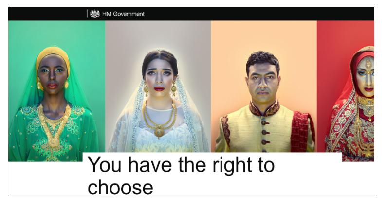
A full-width image or colour block. You will be required to add a title and caption for the banner for accessibility reasons.

The banner image needs to have an aspect ratio of 2.35 : 1

1400px wide (between 500px – 800px in height).

Up to 512KB in file size

Ideally, there should be no text in the banner as this is inaccessible and can often look poor in mobile view.

Banner image

Banner image

b) Large heading / plus “In-Page Navigation”

A large text heading to use to break up other content on your pages. This appears as a full-width block across the page and you customise it to change the background colour, text align and colour.

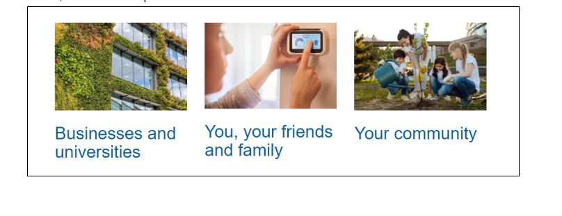
In addition, the large heading section is also used for producing “In Page Navigation / Jump Links”, like this example :

In Page Navigation boxes

In-Page Navigation boxes

This allows users to quickly jump to the relevant section in your overall page.
You will see a check-box option for “Make This Navigation”.

Select “Yes”.

You need to have at least 3 different sections, as in this screen-grab example.

In-page nav. icons seem to work best with a size approx 285 x 178 px.

c) Full-width / Half-width Video

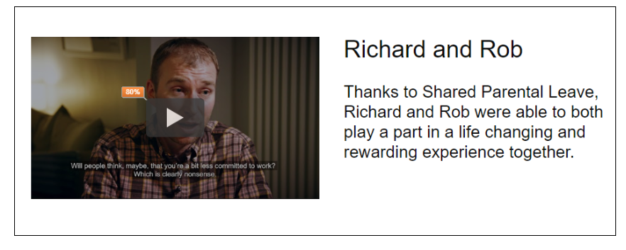
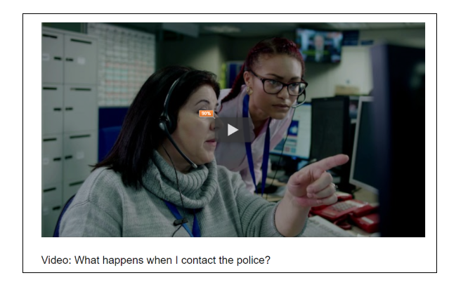
You can add full-width or half-width video to your page by pasting the YouTube URL into the field. You can change the background colour by ticking the checkbox. Examples:

Half-width video

Half-width video

Full-width video

Full-width video

d)Text

Never use bold text.

e) Images

There are three different sections you can use to upload images to a page.

  • Left-aligned image with caption
  • Right-aligned image with caption
  • Full-width image

The left and right-aligned image sections can be used to add a big or small aligned image. A big image takes up 50% of the available area on the page and a small image takes up 30% of the available area. You can display a text caption, which is editable by clicking on the pencil (edit) icon on the image.

For photos, use .jpg or .jpeg and for charts, graphs and graphics use .png. You can add images up to 512KB in file size. Full-width images have to be a minimum of 990px in width.

f) Call-to-action button

This is a full-width block you can add to your page to display a ‘Call-to-action’ button – see example below. You can add descriptor text to appear above the button. You are able to change the background colour. You can also change the colour of the button itself :  see “Sitewide Appearance” section in this guide. There are 3 choices of button colour :

  • blue
  • light grey w/dark text
  • dark grey w/light text.

Buttons may link to any URL.

Important :  check the colour-contrast of the foreground button, versus the background banner colour. The accessibility section in this guide tells you how to check colour contrast.

Call-to-action banner

Call-to-action banner

g) Boxes

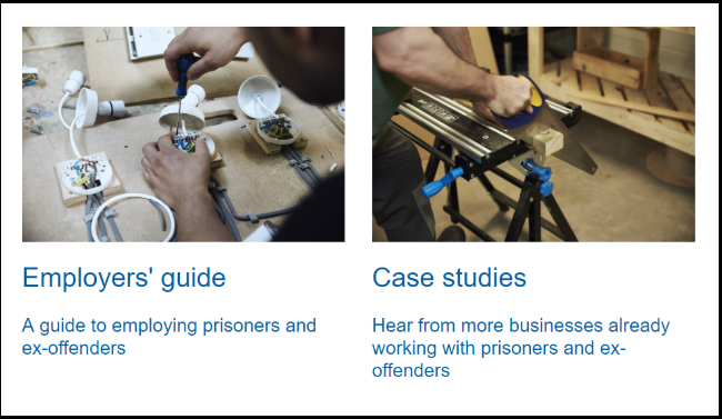
You can add Boxes to your page to link off page to promotional material, case studies or other content which take the user to more information. You need to define a minimum of two boxes, which are displayed in a row across the page. You can choose to add an image, text, caption and button.

For Accessibility reasons :  If you have both a title (larger font) and a caption (in the smaller font) such as in the below example, that is fine. If you only have a title, you should actually add it into the caption field and leave the title field blank (to do otherwise causes an accessibility error)

Link boxes

Link boxes

h) Statistics

A section to display a statistic or some important data. The statistic data is displayed in large font, with the description appearing below it.

i) Block quote

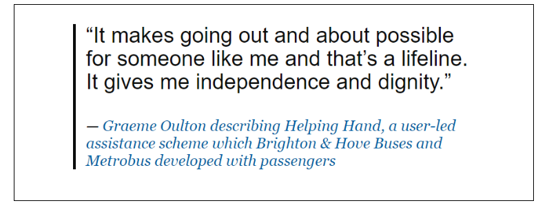
A section to display quotes and citations.

Block quote

Block quote

j) Multiple hidden help text

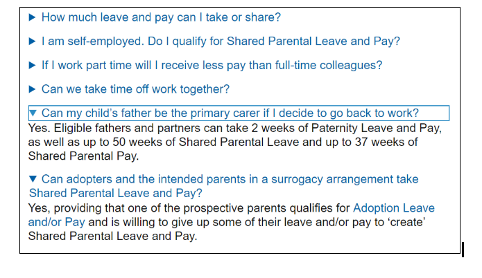
You can add multiple pieces of content which expand into more detailed content when clicked on. Use this to make your page easier to scan, but don’t use it to hide text that users really need to read.

Multiple Hidden Help

Multiple Hidden Help

k) Social Media Links

You can add Facebook, Twitter profile, Twitter hashtag, Instagram, YouTube and LinkedIn. The accounts will be displayed with their corresponding icon.

Social media links

Social media links

l) Twitter Card image & Opengraph image – important!

  • These “cards” are how your site will appear if the link to the site is shared on Twitter or Facebook or when the link is shared on What’s App, Signal etc.
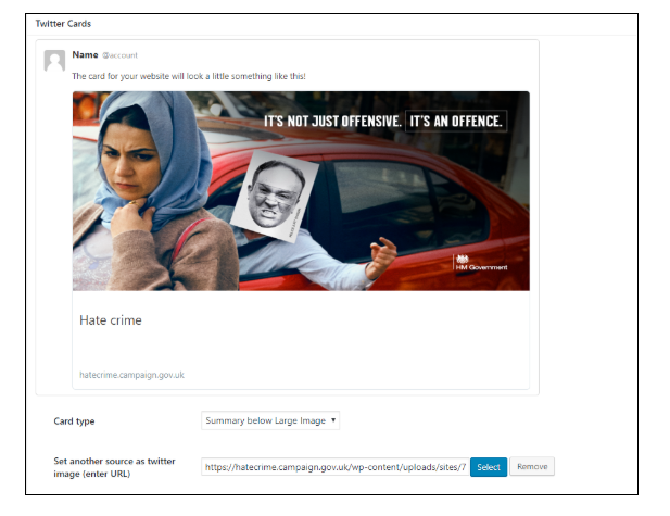
  • The Twitter card function is found at the bottom left of the build page. There are 2 types : (1) Summary or (2) Summary Below Large Image.
  • Add a Twitter card image. For “Summary Below Large Image” (ideal) – advised dimensions at the time of writing (March 2022) are 800 x 418px. 
  • The Twitter card image will appear if the URL is inserted into a tweet, promoting the site, once your site is live.
  • Ensure you give your page a title (top left of build page), as by default will say “Home Page”. The text you provide is used to populate part of your Twitter card.
  • If you don’t add anything, or forget – the default platform-wide Twitter card is a plain black rectangle w/HM government logo. The black rectangle in some cases may be inappropriate, and secondly you will miss an opportunity to promote your site with it’s own branding.

An example Twitter card (“Summary Below Large Image”) :

Twitter card

Twitter card

Opengraph image (for other Social sharing)

This gives your site it’s image/brand when the link is shared on Facebook, What’s App or Signal etc. (It’s separate to Twitter card, and located on the right hand side of the build page, underneath the Meta Description).

Optimum size of Opengraph image is 1200 x 630 (almost 2:1 ratio)

You should test how these appear on as soon as the site is live (can’t be tested before the site is live).


Sitewide Appearance – Button Colours

You can choose to change the colour of buttons across your site. To do this, visit “Appearance”in the left-hand side menu, then “Sitewide Appearance”. You have 3 options  :  Blue; Dark Grey w/ Light Text, or Light Grey w/ Dark Text

3) Accessibility requirements

An “accessible” website is one that works for all people with a diverse range of hearing, movement, sight or cognitive ability. From September 2019, the law changed to ensure standards on accessibility requirements for public sector websites are met. As campaign managers, when building your campaign platform page, there are some basic principles you must now follow to comply with the new law :

a) Images

Alternative text, or “alt text”, is read out by screen readers for those with sight impairments. Avoid images that contain text.

Alt text must:

  • tell people what information the image provides
  • describe the content and function of the image
  • be specific, meaningful and concise
  • Use normal punctuation, like commas and full stops, so the text is easy to read and understand.

Do not:

  • include the name of the photographer or person who created the image
  • start with ‘Image of’, ‘Graphic of’ or ‘Photo of’
  • repeat information from the page
  • include extra information not on the page

Further information on alt text best practice.

b) Links

Your links must be formatted in a way that follows the GOV.UK content design guidelines.

c) Headings

All headings must be formatted using the ‘heading’ formatting in the editor. They can be formatted as either ‘heading 2’ (heading) or ‘heading 3’ (subheading).  Bold must not be used.

d) Videos must be subtitled

This is essential for website accessibility to assist those with hearing impairments, whether it’s done on YouTube’s Closed Caption service or creating burnt-in captions using your own captioning software.

Find out more about video subtitling for accessibility.

e) Colour contrast

Some users with visual impairments won’t be able to interact with your website if the colour contrast isn’t set properly.  We often see fails of colour contrast on call-to-action buttons vs the background banner strip.So ensure there is a clear distinction between font and background colours at all times, so that text is clearly legible.

Review colour contrast using this online tool.

f) Accessibility of 3rd party tools

Some campaign platform sites have decided to use a 3rd party digital tracking product, for example Hotjar. For the user, these typically appear as a pop-up on the screen, for example in the form of a user survey. We have now discovered that some products fail Accessibility tests. If you wish to try to use a 3rd party product, you must test it for accessibility. Unless it passes, do not use the tool.

All GOV websites need to meet GDPR (General Data Protection Regulation) compliance. As campaign managers, you will be responsible for writing a Cookie Notice for your Campaign Platform site.

Any campaigns driving traffic to the site via digital advertising (eg Facebook Pixel, Linkedin Insights) should ensure these cookies are listed transparently in their Cookie Notice.

Review an example Campaign Platform Cookie and Privacy notice

You will need to speak to your department’s Data Protection Officer for full guidance.

Auditing the cookies used on your campaign

You can audit the cookies used on your campaign to help with writing your cookie policy. You will be able to identify the cookies your campaign uses, the purpose of those cookies, and how long the cookies are retained on a user’s device.

You can audit the cookies used on your campaign using a cookie auditing tool. If you have imported scripts using Google Tag Manager, you can use a cookie auditing tool or contact the suppliers of the scripts for more information.

For example, if you’re using Facebook Pixel you can contact Facebook to understand which cookies are set, how they’re used and how long they’re retained.

Webbkoll, Attacat, Cookiebot and OneTrust are all examples of cookie auditing tools. The results presented by cookie auditing tools may not be 100% correct as it is not an exact science.

If your campaign only uses Google Analytics ( _gat, _gid, _ga) – and you do no digital marketing/tracking whatsoever, then your campaign will be covered by the “GDS boiler plate” cookie notice. But you still need to confirm this with the GDS Product Manager to publish this.

Writing your cookie notice

Once you’ve identified the cookies used by your campaign, their purpose and how long they’re stored, you can write your cookie policy. Follow the guidance from the GOV.UK Service Manual to help you write it.

You should outline:

  • the application or script setting cookies, e.g. Google Analytics
  • why and for what purpose the application uses cookies
  • a table showing each of the application’s cookies, their purpose and their expiry.

Publish your cookie notice

Once your cookie notice has been approved by your data protection officer, please send it to the current campaign platform Product Manager at GDS, who can publish it for you.

Google Tag Manager

If you use Google Tag Manager for importing scripts, such as Google Analytics or Hotjar, you will need to consider the impact of those scripts on a user’s privacy.

Google Analytics

Some campaigns use Google Tag Manager to import Google Analytics, and it’s advisable to anonymise IP addresses collected by Google Analytics. You can follow this guide on the Google advertiser forums.

Other platforms

You will need to consider anonymising IP addresses collected by other platforms for analytics, feedback, social sharing and any other scripts you’ve imported using Google Tag Manager.

Privacy Electronic Communications Regulations (PECR) compliance & cookie consent banners

A user’s consent is required for “non-essential cookies” : this is third-party cookies used for online advertising (eg Facebook Pixel, Linkedin Insights) or analytics (eg Google Analytics). Website users must take a clear and positive action to consent to these non-essential cookies – by a pop-up consent banner presented to all visitors to your website ( a choice for users to either “accept” or “decline” cookies ). 

Campaign managers must take action to implement a Cookie consent banner before the site is made live.

A GOV.UK designed fully accessible cookie consent plug-in mechanic is built into the campaign platform. When building your page, this can be found in the “Cookies & Analytics” section of the campaign platform. 

To use the mechanic : select the ‘Cookies and Analytics’ option from the left hand menu of the WordPress Administration interface. Check the box titled ‘Use gov.uk-style cookie settings’. Enter the Google Analytics ID you have been provided.

If you are using Facebook Pixel, LinkedIn Insight or Google Floodlight Tags then check the box titled ‘Include marketing scripts’ and enter the appropriate tags. You are responsible for managing these digital marketing services. 

Please remember the mechanic will not automatically update your cookies and privacy policy with any new digital marketing/tracking tools, and will need to be updated if you add these on. The draft will need to be approved by your DPO, and then emailed to the current GDS Product Manager for publishing.

NB : If you are using Marketing Cookies, the new plug-in mechanic caters for Facebook Pixel, Google Floodlight and Linkedin Partner ID only. If you are using additional digital marketing “tags” (in Google Tag Manager), you will instead have to use a 3rd party Cookie Consent tool (such as CookieBot or Civic). This is because the new plug-in mechanic cannot accommodate any tags above and beyond Facebook Pixel, Google Floodlight and Linkedin Partner ID.

Please visit this page if you need to deploy CookieBot.
5)Content “MoT” checklist & 6 month review

GCS ask you to review the web page every 6 months to ensure your site remains relevant and up-to-date, and we recommend you use the following checklist to inform your page build from the very outset.

Text

  • Headings correctly used throughout. The main banner heading (appears immediately under the banner image) should ideally be no more than 2 lines (3 at most) – 45 to 65 characters.
  • Bold text not used anywhere
  • Links make sense out of context, no ‘click here’ or ‘more’
  • Link text is friendly, i.e. actual words as opposed to a long URL.

Images

  • All images have short, descriptive ‘alt’ attributes. If the image is purely decorative, the tag should contain a single whitespace. Read further guidance on decorative images
  • All images are optimised for the web (try http://optimizilla.com/) as far as possible whilst avoiding pixelation.
  • Any images of graphs, infographics etc. are accompanied by a full text description. (So that they can be read by screen readers, but also by search engines.) They are also easily readable on mobile
  • There are no images containing text which could otherwise be represented as normal text

Campaign content

  • There are a maximum of 3 calls to action – the campaign should be focussed in its aims. Don’t try to do too much with it
  • Content isn’t repeated, and links to GOV.UK when content already exists
  • Text is concise and doesn’t become verbose – what does the user really need to read?
  • Your videos have captions

Style and layout

  • The main call to action appears in the top half of the website, and stands out sufficiently from the rest of the content
  • Clear colour contrast is maintained across the site
  • The ‘block quote’ element is only used for short quotes

Analytics

  • Are your monthly user targets are being reached? (If not what are the reasons? How are you getting users to the site? Is it time for the site to be closed?)
  • Are your main calls to action clear ? If not could your page be arranged differently to help users find them ?

In the 6 month review, we will ask you to evaluate your content again based on the above check-list, and we will also ask you to provide a short description of how the website has met your objectives and KPIs in the last 6 months.

6)User admin rights

Your campaign site will have a named Admin, who will be responsible for creating user accounts for anyone else in their team that will be involved in building the site and managing it in the future.

The three main roles you can choose from are:
Admin – the Campaign Owner who has access to all the admin features on the site (1 or 2 people in your organisation)
Editor – the Campaign lead who is responsible for reviewing content and publishing
Contributor – Campaign team members who can create and edit content, but cannot publish

You can read more about the different roles.

7)Additional guidance and help

For campaigns sites, you will need to be aware of the different types of content you can create. Before writing and publishing on the Campaigns platform please read Writing for GOV.UK which will give your team some guidance on the best way to write for the web, GOV.UK and the campaigns platform.

WordPress doesn’t require special training but if you need some help, see WordPress Made Simple or the WordPress official user guide.